Semi-structured SMB interviews, affinity + empathy mapping
Dashboard UX, metric cards, edit mode, AI Insight layer
Built the full component library: cards, states, navigation
Dashboard copy, alerts, onboarding, pricing tier names
3 paid tiers, technical feasibility, pitch deck narrative
7 tabs. No clarity.
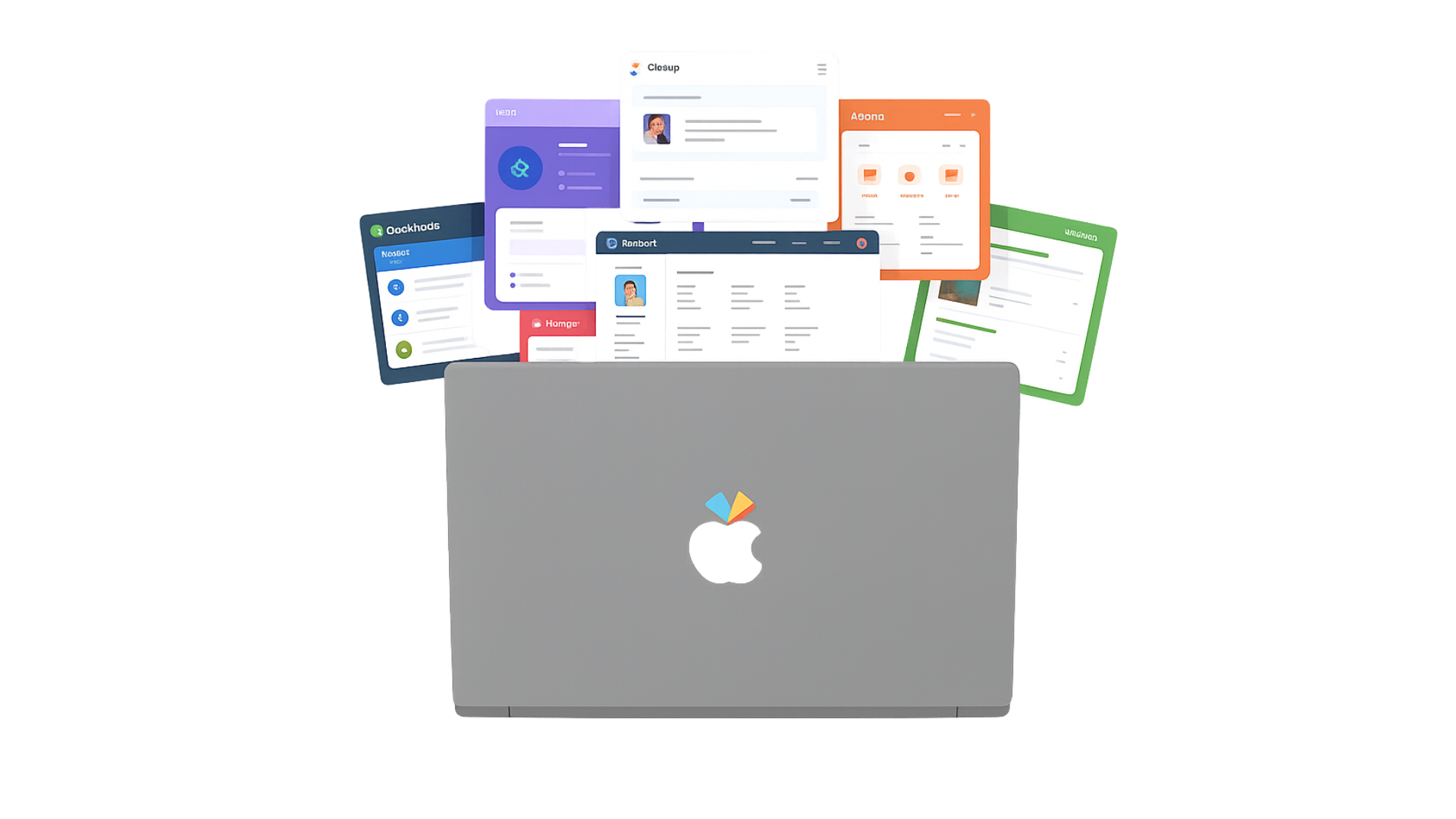
SMB founders weren't failing to collect data. They were drowning in it. HubSpot, ClickUp, Slack, spreadsheets: each told a different story. None told the whole one. The problem wasn't access to data. It was the inability to act on it.
"Without someone looking at this for me, these tools are just a waste of money."
I talked to real founders first.
Before opening Figma, we conducted qualitative discovery research: a semi-structured interview with a U.S.-based SMB founder generating $250K to $1M annually. We followed with secondary research: business blogs, industry publications, and internal documents from the client. Findings were synthesized through affinity mapping and empathy mapping to surface the clearest pain points.
1 semi-structured interview · U.S. SMB founder · $250K to $1M revenue · Affinity + empathy mapping
Industry publications · Business blogs · Internal documents · Goal: validate assumptions and build a complete picture of SMB operational pain
"I know the numbers, but I can't track everything at once."
"I forgot we usually run an October campaign... it was too late."
"Without someone looking at this, these tools are a waste of money."

One dashboard. One next move.
Three needs from research became the product's core promise: see your data, understand what changed, know what to do next.
Connect any tool in 2 clicks. All business metrics in one real-time view: revenue, tasks, pipeline.
AI Insight mode surfaces what changed and why. Proactive alerts mean catching issues before they become crises.
AI recommends a specific next move. Not just data: direction. The dashboard tells you what to do next.
The screens. The system. The words.
As product designer on a team of four working directly with the company's CEO, I owned the dashboard screens, built the design system, wrote all UX copy, and co-led the pitch narrative.
Metric card system, edit mode, alert notifications, and the AI Insight layer. Designed for a founder with 10 minutes, not an hour.
Full component library: cards, states, badges, navigation, two-step tool onboarding. Visual consistency across all views.
All dashboard labels, alert copy, onboarding microcopy, and pricing tier names. "See Everything / Understand Everything / Predict Everything". Each name is a value proposition.
Co-led the narrative arc: opened with the founder's story, grounded it in data, presented the product as a direct answer to each pain point.
Same thing. Different thing.
Solo built & shipped. A Chrome extension that fixes a daily LinkedIn UX pain.
Small businesses deserved a landing page that spoke their language. We rebuilt it.