They're not looking for content.
They're looking for belonging.
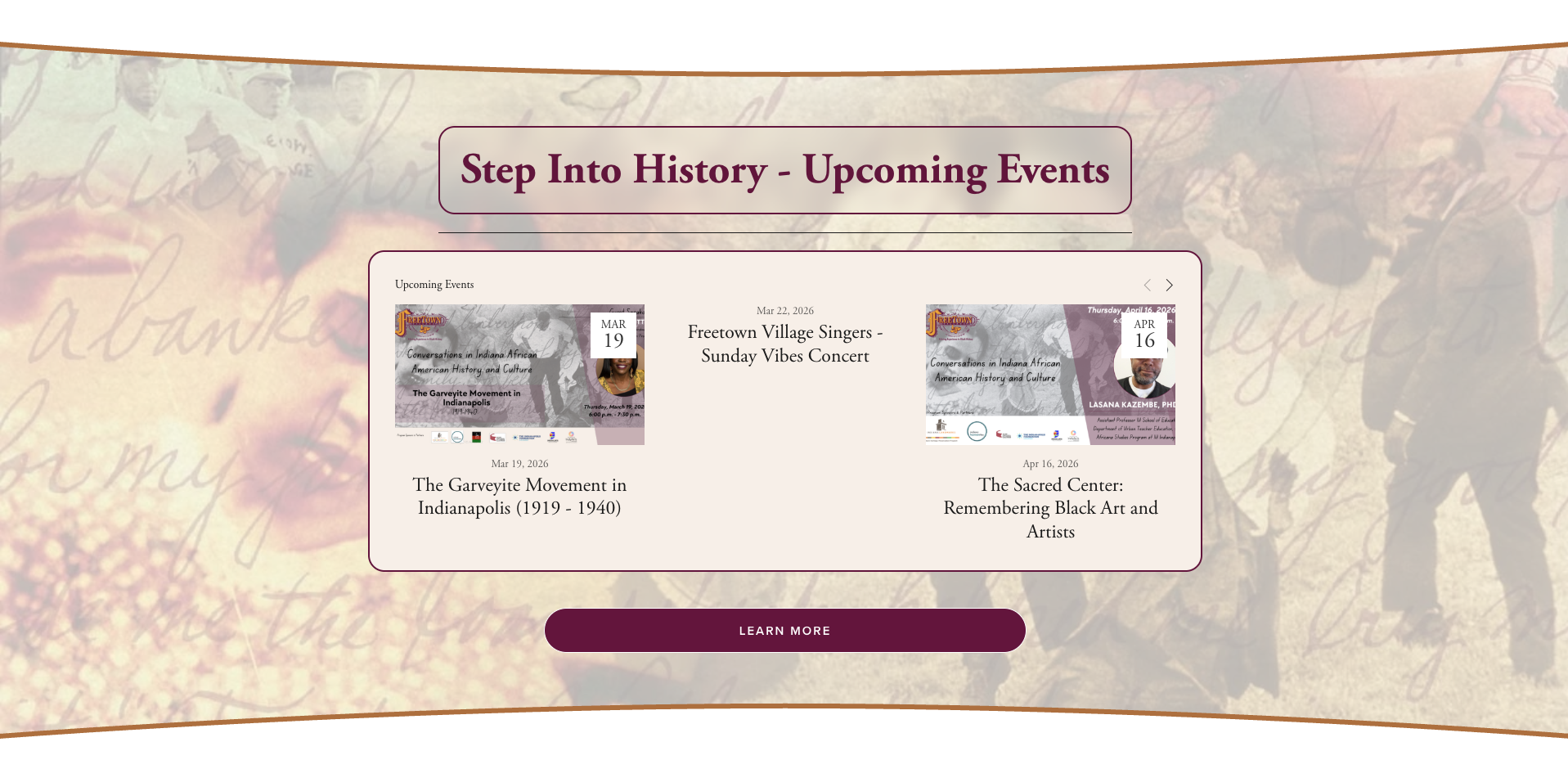
Freetown Village has been telling the story of 19th-century Black Indiana for 40 years, through live performances, historical reenactments, and community events. But their audience had aged with them. The organization was effectively invisible to young Black Americans: the exact generation that has the most at stake in finding cultural grounding.
The brief was vague: "help us reach younger audiences digitally." Our job was to understand why the gap existed before we designed anything to close it.
of African American teens want to learn how slavery's legacy still affects them today
have already talked with relatives about family ancestry, the appetite for connection is real
only trust social media for accurate historical information. They want institutional credibility.
Design for belonging, not just awareness.
Build a digital platform that turns Freetown Village's 40 years of storytelling into an interactive, community-driven experience Gen Z actually wants to return to.
Gen Z actively seeks Black history and cultural connection. But static institutional websites don't match how they engage. The format was the barrier.
Prototype-ready and developer-handoff-complete within 2 months. No existing design system to build from. Every decision needed research backing and usability testing before it was finalised.
Four conversations. Three core needs.
As research lead, I conducted 4 user interviews with community members aged 23–35, the segment Freetown Village had never meaningfully reached. Rather than asking "what features do you want," the interviews explored how they currently engage with culture, what makes them trust a source, and what they wish existed. Three themes emerged consistently across every conversation.
Credible sources in a landscape of misinformation. Gen Z doesn't want to learn from content farms, they want institutional credibility.
Active participation. They'd experienced Freetown Village in person and the "fourth wall break" is what makes it memorable.
Connection with others on the same journey. Cultural learning felt isolating alone; shared with others it became identity-building.
Help young digitally active learners connect with trustworthy and interactive experiences, so they feel more grounded in their historical roots?
From insight to concept in three moves.
With Trust, Interactivity, and Community as our constraints, we ran Crazy 8s and rapid brainstorming to explore how to digitize what made Freetown Village's in-person experience powerful.
Three key questions framed the ideation:
How do we replicate the "fourth wall break" characters do in live events, in a digital space?
What makes history feel personal, tangible, and worth inhabiting?
How can a nonprofit realistically build and maintain a digital audience without a large technical team?
Three features emerged that mapped directly back to the three user needs. These weren't arbitrary, each one had a clear research justification for why it existed.
Real-time performance streams with interactive quizzes and community chat. Freetown Village's credibility as the host addresses the trust gap directly.
Earn points through participation, unlock historical artifacts, build a personal 3D museum. Makes cultural exploration tangible and permanent, yours to keep.
Moderated spaces to discuss performances, share family stories, and connect with historians. Recreates the shared experience that makes in-person events stick.
From Crazy 8s to a testable prototype in Figma.
Once we had our three features mapped to research needs, we built a low-fidelity prototype in Figma to make the concepts testable. The prototype covered all three flows: joining a live watch party, navigating the Museum of Memorabilia point system, and using community chat threads.
This phase was also used to begin establishing component logic. Even at lo-fi, consistent patterns across the three features kept testing feedback focused on the experience.
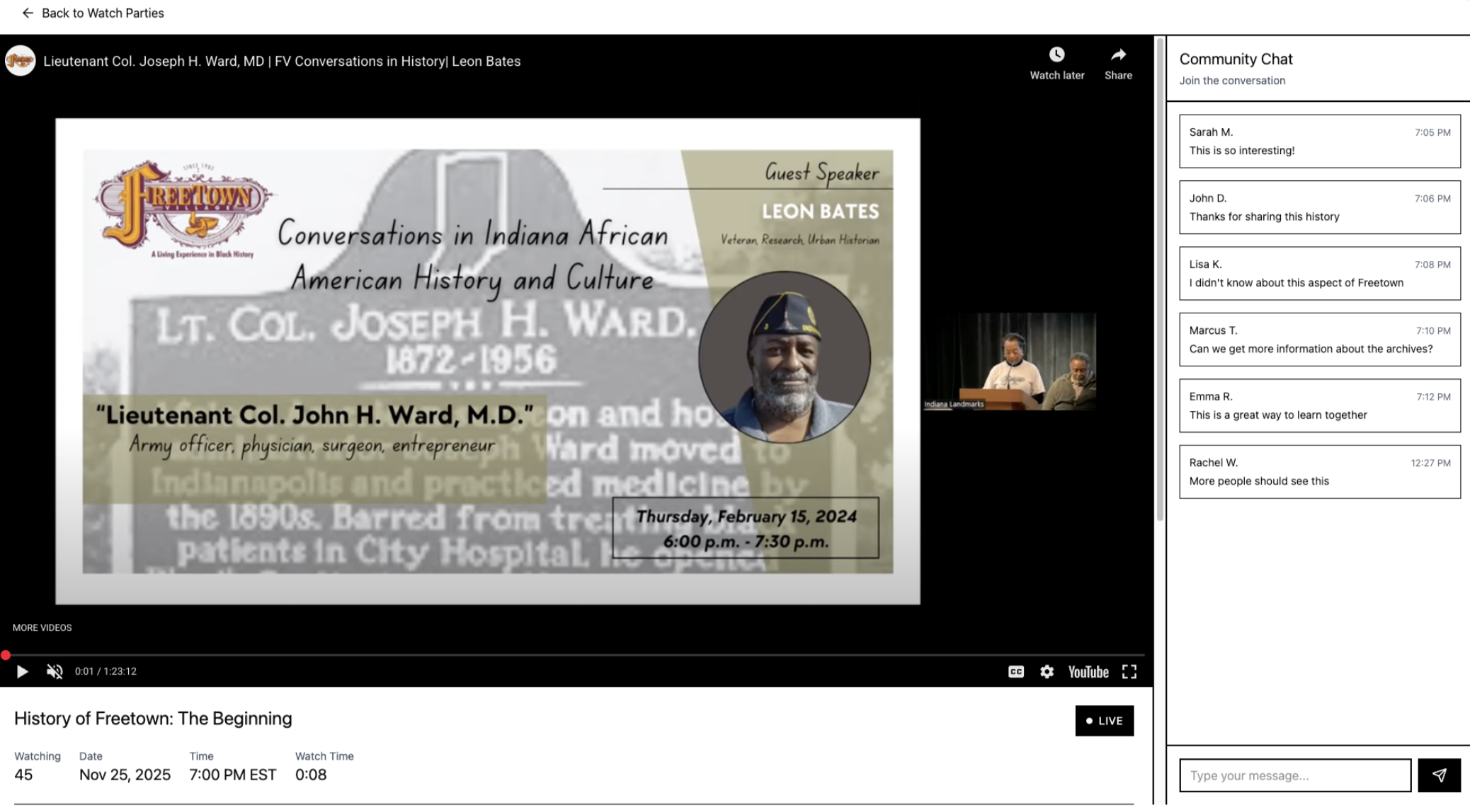
Joining and participating in a live watch party with real-time community chat.
Earning points through participation and unlocking artifacts in the Museum of Memorabilia.
Navigating and posting within moderated community chat threads.
A concept we built into the lo-fi: the points economy
Participation earns you currency. Currency you can use to build your virtual museum with.
Points are earned through participation: attending live watch parties, engaging in community chats, and completing cultural challenges.
Points unlock historical artifacts in your personal museum and can be redeemed for exclusive Freetown Village merch.
Users can also purchase coins directly to fast-track access to artifacts and merch. A revenue stream that keeps the platform sustainable for a nonprofit.
We built a community feature.
Users told us it could become a weapon.
We ran think-aloud usability testing on a low-fidelity Figma prototype with 4 participants. As research lead, observations and notes were captured across three tasks: joining a live watch party, earning and spending points, and using community chat threads. Two things happened, 88% said they'd recommend it. And three things broke.
"People say terrible things." Multiple participants expressed real concern that an unmoderated community space could replicate the exact online toxicity they were trying to escape.
Moderated chat, private party options, visible safety indicators.
"I wasn't sure where they came from." Participants couldn't connect earning points to the cultural archive, the gamification felt arbitrary without context.
Explicit onboarding explaining the point system. Visible balance tracking. Cultural framing: "Your Cultural Journey."
"Pop-up blocks the live play." Quizzes appearing mid-performance broke the immersion at exactly the wrong moment, frustrating the users most engaged with the content.
5-second countdown timers. Quizzes repositioned to side panels with a skip option.
7 out of 8 interview participants said they would recommend the platform to a friend interested in Black history and culture. Alongside the failures, this was the most important signal. The concept resonated. The execution needed tightening, and now we knew exactly where.
Three features. One system.
We built the prototypes and component library in Figma, establishing visual consistency across all three features so the product felt like one cohesive experience. Each component was designed to scale as the platform grew.
A vision that had to be buildable.
Most UX projects stop at validated prototypes. We knew Freetown Village is a nonprofit, if the technical or financial model wasn't viable, even the best design would stay theoretical. So we stress-tested it.
Pricing tiers we designed
- · Basic museum room
- · Completed event clip access (limited)
- · Public chats
- · Weekly drops
- · Full museum room
- · 1 watch party per month
- · All chats, unlimited uploads
- · Full museum room
- · Unlimited watch parties
- · Private parties (custom rooms)
- · Early access to Freetown merch
*Users can also buy single events separately on a per-need basis.
Proven at scale, every tool is used by Fortune 500 companies. No experimental tech risk.
Pay-as-you-go, costs grow only as users grow. No large upfront infrastructure spend.
Mobile-first, the primary access point for the 23–35 demographic.
Phased build, Watch Parties can launch first. Museum and Community follow as resources allow.
Validated. Designed. Ready to build.
This was a conceptual project, the platform hasn't launched yet. But the research and validation metrics tell a clear story about whether the concept has legs.
User growth figures are projected estimates based on research signals and comparable platform benchmarks, not live data. The project was delivered as a validated concept and pitch to the team.
What I took away.
Designing for a nonprofit with no engineering team forced us to interrogate every feature: is this buildable? Is this maintainable? The business strategy section wasn't extra work, it was what separated a usable concept from a fantasy.
The safety concerns users raised during testing weren't a UX problem, they were a reflection of their lived experience online. Designing for community means designing against the harm communities have already experienced. That's a bigger brief than we started with.
Building the component library early forced us to make decisions about hierarchy, tone, and interaction patterns before we built individual screens. It made the team faster and the product more coherent.
The "looking for belonging" reframe didn't come from the team, it came directly from interview participants. My job was to create the conditions for that insight to surface, then make sure we built toward it.
Designing Salesforce's AI-powered analytics experience for enterprise teams.
Small businesses deserved a landing page that spoke their language. We rebuilt it.