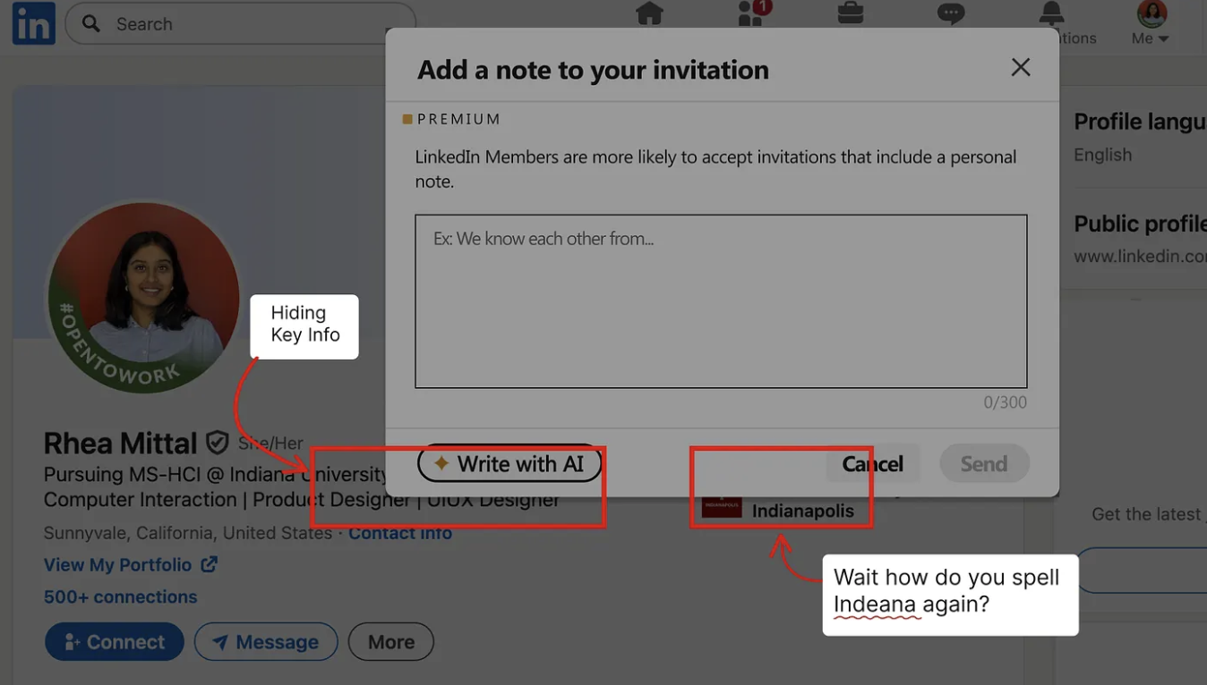
The modal that blocked your context.
LinkedIn's "Add Note" modal opens directly on top of the person's profile, hiding their name, title, and company at the exact moment you need it to write something personal. So you close the modal, re-read the profile, reopen the modal, try to hold the details in working memory, and start writing. Every time. For every connection.
A small friction, but one that compounds fast when you're actively networking. And for a platform built around meaningful connection, it was a surprisingly avoidable problem.
I posted about the friction on LinkedIn. Product designers and engineers replied within hours confirming the same pain. That was the signal I needed to move forward.
"This is something I deal with every single day."
"Pretty cool solution. I would even like it."
"So relatable! Love the speed of your brainstorming."
Find a fix that anyone could use.
Fix the UX friction on LinkedIn's "Add Note" modal and ship a solution anyone could use publicly, not just a personal workaround.
LinkedIn's modal covers the person's profile at the exact moment you need to read it to write something personal.
Lightweight, Chrome-compatible, no personal data parsed or recorded, and simple enough to ship publicly on the Chrome Web Store.
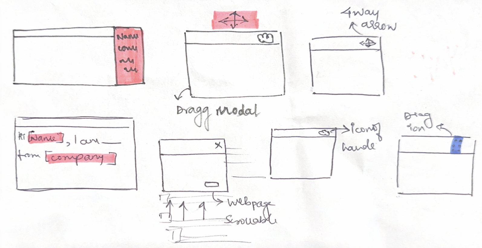
Two decisions. Both tested.
I started by sketching on paper, not Figma. Six approaches for the same constraint: how do you expose profile context without creating a new interaction pattern? Each one tested against three questions: does it feel native? Does it break LinkedIn's layout? Can it be built safely without reading personal data?
One concept cleared all three. Then the icon needed two tries.
Why the final concept was selected for the build
A drag handle requires minimal DOM injection, no scraping, no new UI surface. One element. That's it.
Less complex logic meant Cursor could generate cleaner, more reliable code. Simpler to describe in a PRD, fewer edge cases to get wrong.
Critical: the extension doesn't parse or record any personal data from the person receiving the connection request. Privacy-safe by design.
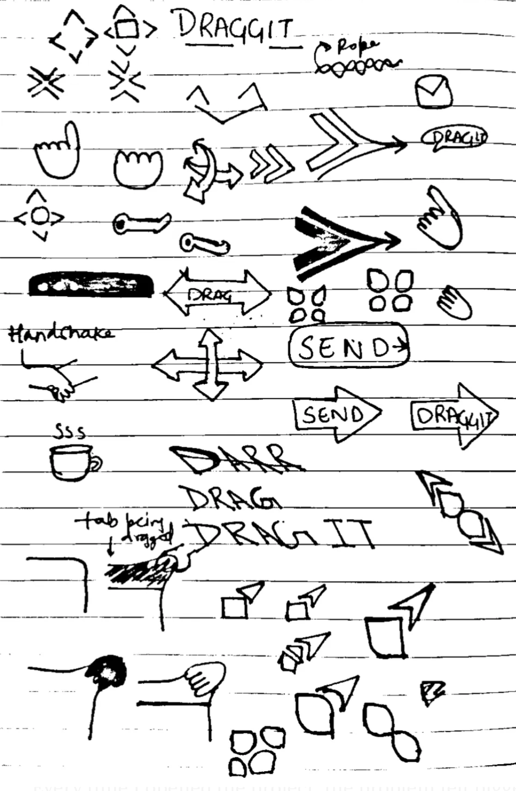
Icon ideation sketches, exploring drag metaphors before landing on the 6-dot grip
Showed two icon options to two friends. Both picked the 6 dots. Both guessed "drag" without prompting.
Vibecoded with AI tools.
I didn't just prompt-and-paste. I treated AI as a specialized collaborator on each phase of the build, with a different tool playing a different role. The design and product decisions stayed mine throughout.

Before writing code, used ChatGPT to evaluate the technical feasibility of each solution option. Key question: what can a Chrome extension actually do to LinkedIn's DOM? Confirmed injecting a drag handle via content script was viable.
Wrote the full PRD, translating interaction specs, edge cases, and design decisions into structured engineering requirements. Having a PRD meant Cursor had clear context and constraints, not just vibes.
Built the Chrome extension: manifest, content script, drag logic, position memory. I directed the build, reviewed every output, debugged failures, and iterated when LinkedIn's dynamic DOM caused issues. Cursor wrote code; I owned the product.

Rapidly explored UI variations of the drag handle and icon: color, size, shape, hover states without touching code each time. Landed on the 6-dot grid that tested best with real users.
One drag. Full context restored.
The Product: Connect with Convenience
Move it to clearly see the hidden profile information: name, title, company, while you write.
Reference the profile while you're writing. No need to close the modal, re-read, and reopen just to double-check a spelling.
Write a personalised note knowing you have the full context in front of you. Fewer generic notes. More genuine first impressions.
Rejected by Chrome. Debugged. Resubmitted.
After submitting, I received a rejection email. I was gutted, I'd put real work into this. But I decided to sit with it, read through the manifest carefully, understand exactly why Chrome had flagged it, and fix it properly. I'd gotten this far. I wasn't stopping at the finish line.
Overly broad manifest permission flagged by Chrome. No appeal. Fix and resubmit.
Scoped permission to minimum needed. Rewrote manifest fields. Approved within 72 hours.
Goal met. Then some.
From a personal frustration to a live product with real users, the goal of fixing the friction and shipping it publicly was fully realised.
What I took away.
Simply animating a concept in Figma gave me everything I needed: validation that the pain was real, and early feedback on what features people actually wanted. I didn't need a polished prototype, a rough animation was enough to get signal.
The Chrome Store rejection forced me to understand the permission model properly. Highest-value moment of the whole build.
Small businesses deserved a landing page that spoke their language. We rebuilt it.
Small businesses had the data. They couldn't use it. We built the tool that changes that.