CliquePrize wasn't connecting with their target users. I rebuilt the landing page's IA and UX writing around 4 core questions every SMB owner actually asks, driving a 24% lift in CTR.
Redesign the CliquePrize landing page so potential users could feel the product's sophistication and be compelled to act. The brief was a design ask. The underlying need was a CTR problem.
The Brief
Redesign the landing page. No user data, no success metric, no clear direction provided.
The Constraint
6 weeks. Early-stage startup. No existing user base to test with.
00 Context
THE BRIEF CALLED FOR A REDESIGN. I STARTED WITH RESEARCH.
Brief: redesign the landing page. No user data. No success metric. No direction. Before a single screen in Figma, I made the case for a research-first approach.
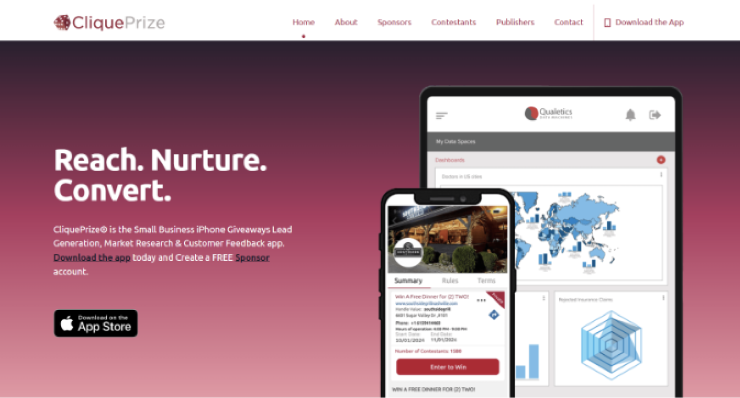
The original landing page: "Reach. Nurture. Convert." spoke to no one in particular
Research Push
1 week. I found the users myself.
Early-stage startup with no existing user base. I asked for one week before opening Figma. Ran competitive analysis, observed the live page, and recruited SMB owners from my own network for informal sessions.
Key Insight
The problem wasn't aesthetic. It was linguistic.
The page wasn't speaking to the right person. SMB owners couldn't see themselves in the story. Not because the product was weak, but because every word was written for someone else.
Observational sessions on the live page showed where attention dropped. Interviews with SMB owners revealed what language they actually used when talking about their own businesses, and how far the page was from meeting them there.
"
"I don't need an overly complex explanation of what something does. Just explain what you do and how I can use it."
SMB Owner, research interview 2025
Secondary Research
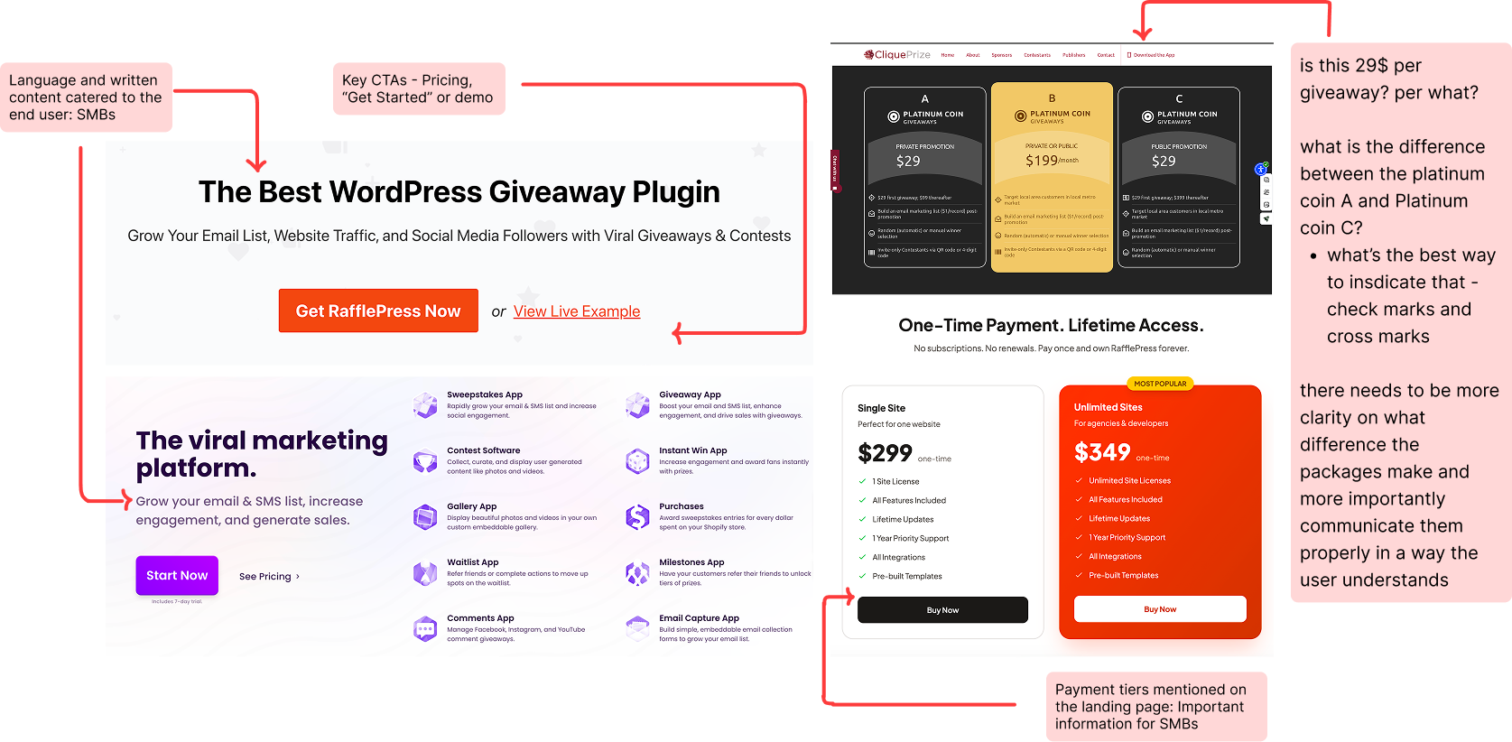
Competitive analysis: RafflePress, ViralSweep, and CliquePrize. My note on the original: "Is this $29 per giveaway? Per what?" The copy assumed knowledge SMB owners didn't have.
Finding 01
The hero needs the core use case
"Grow Your Email List" converts immediately. "Reach. Nurture. Convert." requires translation the visitor shouldn't have to do.
Finding 02
Show the product from the customer's perspective
RafflePress shows the giveaway widget: what the customer experiences. CliquePrize showed the admin panel. Wrong perspective, wrong audience signal.
Finding 03
Both competitors surface value before pricing
CliquePrize had no pricing on the homepage at all. A critical trust gap for SMBs evaluating a new tool.
02 Information Architecture
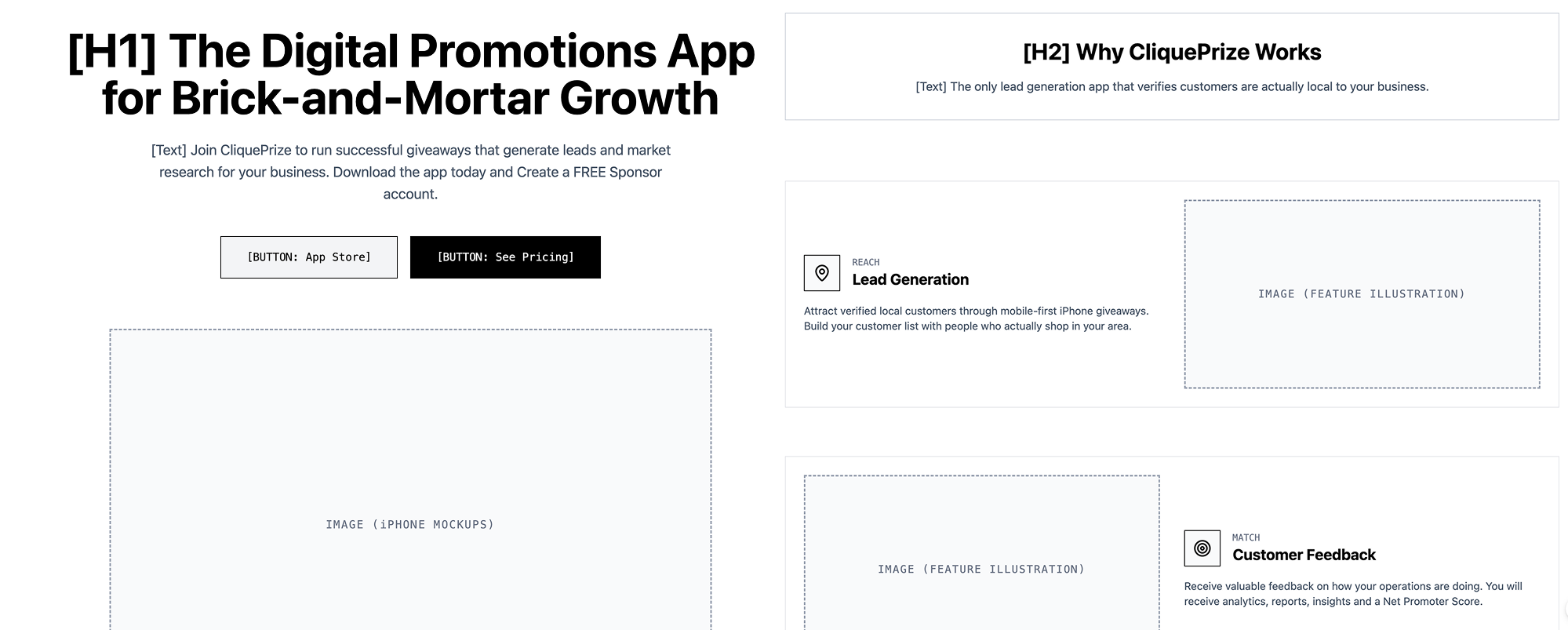
I restructured the page around four questions.
Pivotal Reframe
The original copy assumed the user already understood the product. Every headline was written for someone who had already bought in. I flipped it: write for the SMB owner who has never heard of CliquePrize, and make the value land in the first five seconds.
Q1
"What is this?"
Hero headline answers immediately in plain language. No jargon, no features.
→ Hero
Q2
"Why do I need this?"
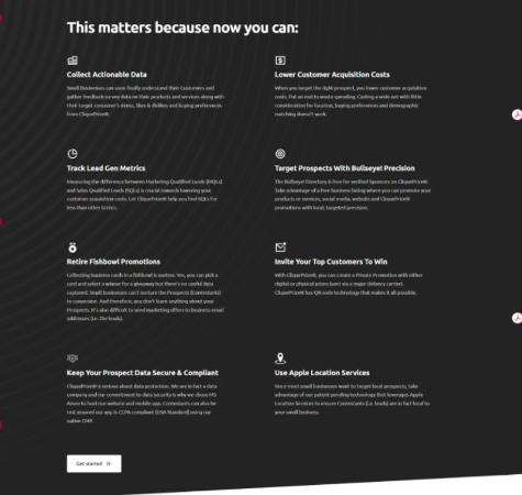
User pain first, features second. Consequences before capabilities.
→ Problem Section
Q3
"Why CliquePrize?"
Social proof, trust signals, differentiators, moved up from after pricing.
→ Features + Proof
Q4
"What does it cost?"
Pricing last, after the user has a reason to care. Renamed tiers, clear feature diff.
→ Pricing
Low Fidelity Wireframe
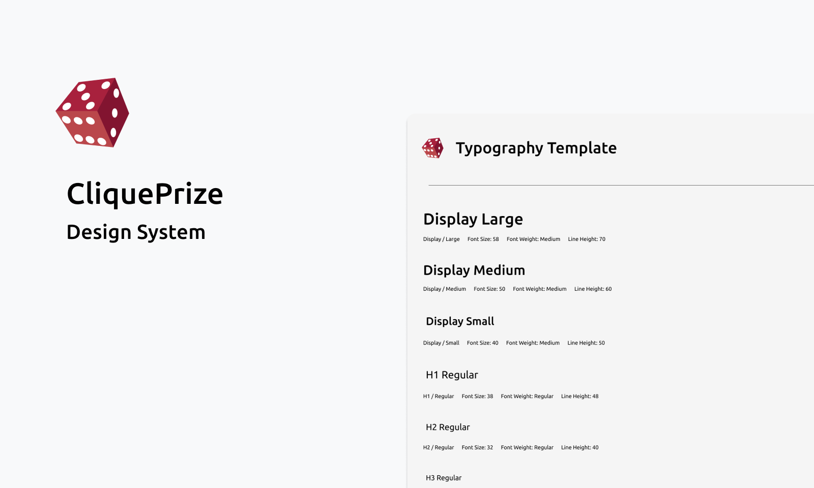
03 Design System
Starting the design system.
Before designing the landing page, I built the component library. CliquePrize has three distinct user types: Contestants, Sponsors, and Publishers. Each has different needs, trust signals, and entry points. Building a shared component language first meant the landing page could scale to serve all three without rebuilding from scratch each time. 15+ components: buttons, cards, inputs, nav, pricing tables, and mobile UI, all documented with states, specs, and three separate colour token sets for dev handoff.
15+
Components: buttons, cards, inputs, nav, pricing, mobile UI
3
User types with separate colour tokens: Contestants, Sponsors, Publishers
60%
Faster dev handoff: every component documented with states and specs
The full design system: typography, colour tokens, and 15+ components built before touching the page
04 Visual Redesign
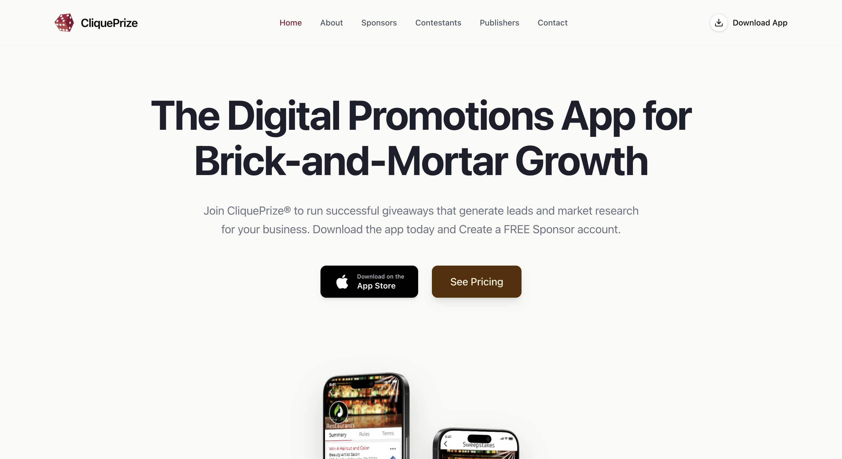
Redesigned to fit the product and the people it was built for.
I rewrote and redesigned the landing page from the ground up, not to make it look better, but to make it match the product it was selling and the users it was selling to.
BeforeCluttered layout, generic stock imagery, tagline-first copy, no clear audience
AfterClean hierarchy, benefit-led headline, app screenshots at the right scale, clear call to action
05 UX Writing & Feature Work
Highlights of the changes made.
The work went beyond copy edits - each change was grounded in competitive analysis, user research, or usability findings. Here's what changed and why.
Change 01
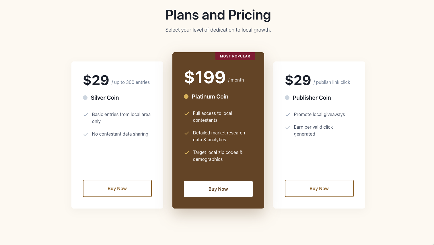
Pricing Transparency
Hidden pricing is a trust-killer for price-sensitive SMBs. Transparent tiers let users self-qualify on budget without needing a sales call.
BeforeNo pricing on homepage
AfterStarter / Growth / Pro visible upfront
Change 02
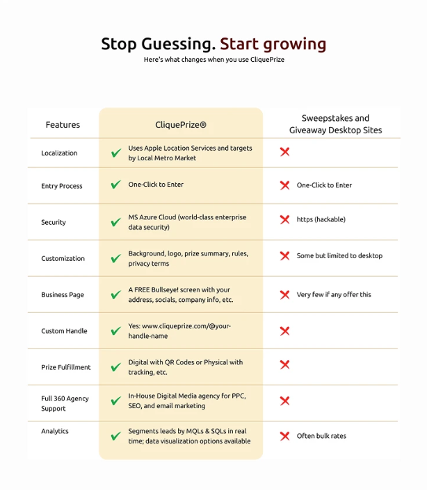
Comparison Table
Before
After
SMB owners compare 3–5 tools before committing. I built the table to surface CliquePrize's unique edges — like geo-targeting — honestly, without overpromising on feature parity.
BeforeNo comparison context
AfterSide-by-side table with honest parity signals
"She took ownership across the full design process, from the design system to the homepage redesign, with a strong focus on clarity, usability, and user-centered messaging. She was detail-oriented, easy to collaborate with, demonstrated a strong product mindset, and knows how to work closely with engineers."
Rob Salerno, CEO
07 Reflection
What I took away.
The most important design decision wasn't visual, it was insisting on research first. The brief assumed aesthetics. The research revealed a language problem. That reframe shaped everything.