UX Research + Feature Design · Canvas LMS · Team of 4 · 2024
Integrating AI into the world's most-used LMS.
We redesigned Canvas's quiz creation flow for educators, adding AI-powered generation, autosave, and progress indicators. Research-backed across 3 fidelity levels, validated with 8+ faculty.
My Role
UX Research + Feature Design
Team
4-Person Design Team
Timeline
2.5 months, 2024
Platform
Canvas LMS (Web)
Tools
Figma, Adobe Illustrator
01 The Brief
A Tool 40 Million People Use Every Day With Frustration
Canvas is the learning management system used by universities across North America. Faculty use it to build courses, manage students, and create assessments. It is deeply embedded in how education runs.
And it is genuinely painful to use.
Our brief was focused: redesign the quiz creation experience for educators. Not a rebrand. Not a full overhaul. One high-friction workflow, fixed. We had 2.5 months, a team of four, and real faculty to test with.
"The system hasn't been updated in years. There is the general feeling that the world has passed it by."
- Professor, Teaching Faculty
02 Research
We Asked. They Had a Lot to Say.
We interviewed 8+ educators and faculty to understand where time was being lost and where frustration ran highest. We also ran observation sessions - watching faculty actually build quizzes - and measured time on task, click count, error rate, and task completion.
8+
Faculty Interviewed
Educators across disciplines, from first-year lecturers to tenured professors building complex assessments.
3
Fidelity Levels Tested
Lo-fi, mid-fi, and hi-fi - each round measured against the same four metrics to track real progress.
4
Metrics Tracked
Time on task, click count, error rate, and task completion rate - consistent across every round.
Baseline - before we touched anything
273s
Avg Task Time
24.5
Avg Click Count
0%
Error Rate
100%
Task Completion
Tasks completed - but not easily. 273 seconds and 24.5 clicks to build a single quiz. That's the problem.
03 The Problem
Three Problems. One Broken Flow.
Faculty weren't failing to complete quizzes - they were succeeding slowly, anxiously, and with too much effort. The research surfaced three systemic issues driving it all.
01
No Progress Visibility
Faculty had no indication of how far through a quiz they were. Every session felt like starting from zero. The anxiety of lost work was constant.
02
Redundant Manual Actions
Creating similar question types required fully manual re-entry each time. Settings couldn't be copied or templated. Save had to be hit repeatedly - or risk losing work.
03
Poor Feedback Mechanisms
The interface gave no confirmation, no error states that helped, and no signal that anything was working. Faculty had to hold the whole quiz in their head.
"There are so many things I have to specify, I have to type everything - it never remembers what I did last time."
- Faculty member, during observation session
04 Design Process
We Tested at Every Fidelity. The Data Told Us What to Cut.
We ran structured usability tests at lo-fi, mid-fi, and hi-fi - measuring the same four metrics each time. This gave us a consistent signal across the full process, not just at the end.
The key question for each round wasn't "does this look good?" It was: does this reduce time, reduce clicks, and reduce cognitive load - without introducing new errors?
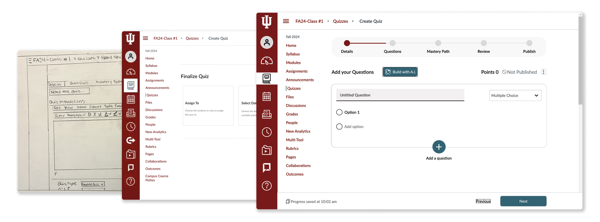
Lo-Fi
Diverge: explore the space
Multiple directions per pain point. Quick sketches and flows. Tested with 3 faculty - looking for directional signal, not polish.
Mid-Fi
Converge: kill what doesn't work
Narrowed to strongest concepts. First test of AI integration - initial version added complexity, not removed it. We pulled it back.
Hi-Fi
Validate: measure the delta
Full interactive prototype. Simpler AI flow, progress bar, restructured nav. Measured against the same baseline metrics.
The mid-fi learning: our first attempt at AI generation asked too many questions upfront. Faculty felt overwhelmed. We stripped it to a single prompt input - topic, level, and a reference upload. That's it.
Lo-fi wireframes to hi-fi prototype - how the quiz builder evolved across testing rounds
05 Solutions
Three Fixes. All Grounded in the Data.
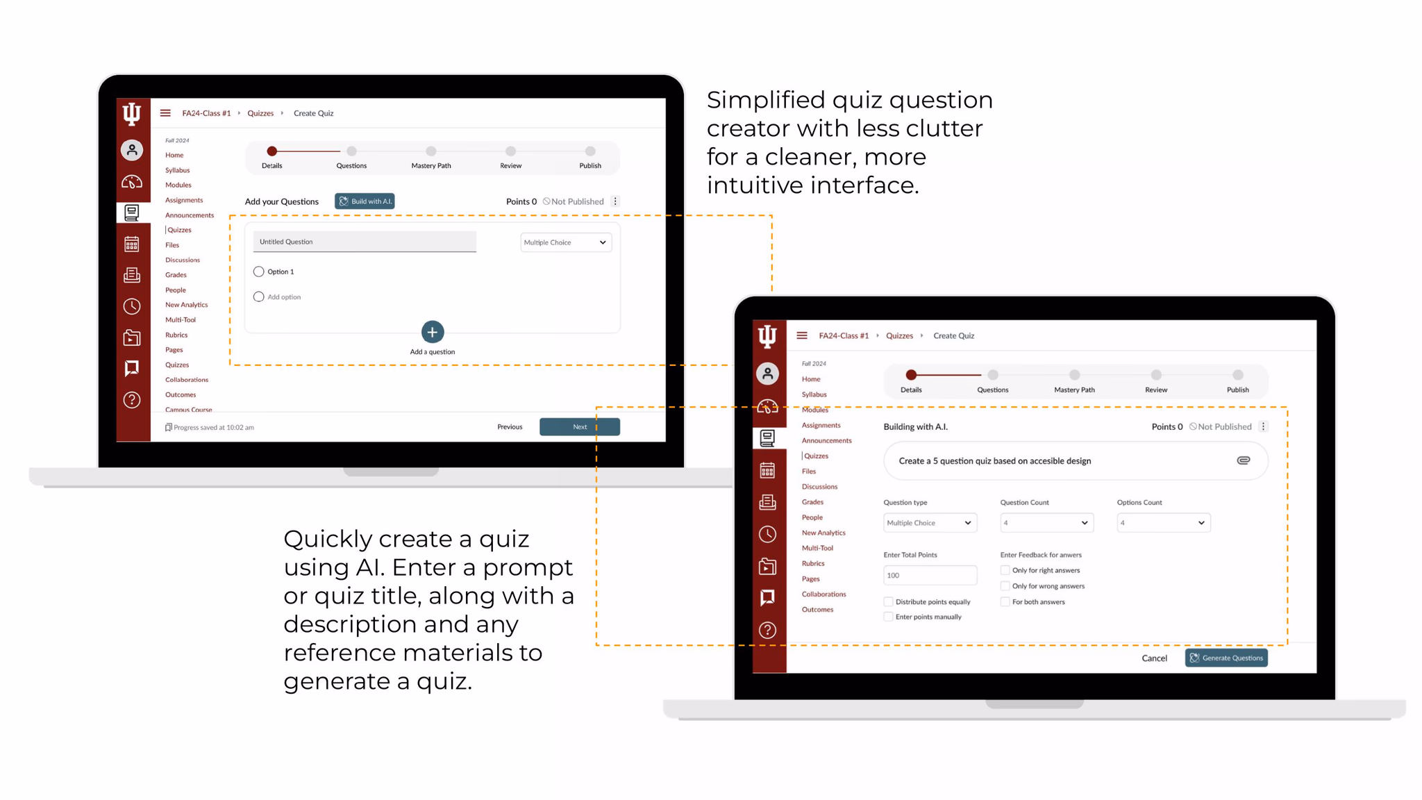
Every solution maps directly to a pain point from research. Nothing added for aesthetics. We focused on reducing cognitive load at each step of the quiz creation flow.
Solution 01
Addresses: Redundant manual actions
Build with AI
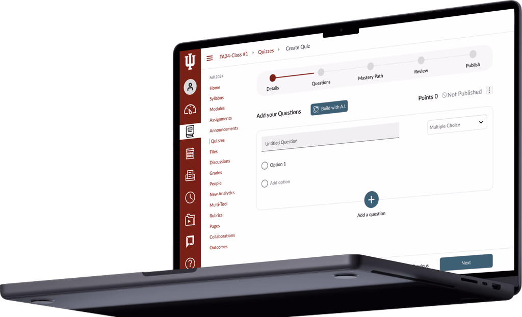
Faculty enter a topic prompt, difficulty level, and optional reference material. Canvas generates a full quiz - editable, reviewable, not locked in. The AI doesn't replace the educator's judgment; it handles the typing and structuring so they can focus on content quality.
Solution 02
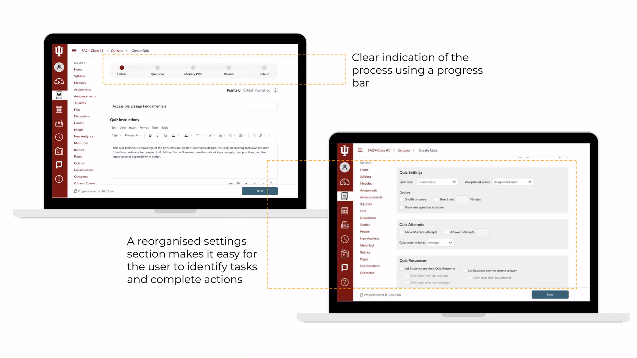
Addresses: No progress visibility
Progress Bar + Autosave
A persistent progress indicator shows educators exactly where they are in the quiz creation flow. Combined with autosave, the anxiety of losing work disappears. Faculty can stop mid-session and return without fear.
Solution 03
Addresses: Navigation friction
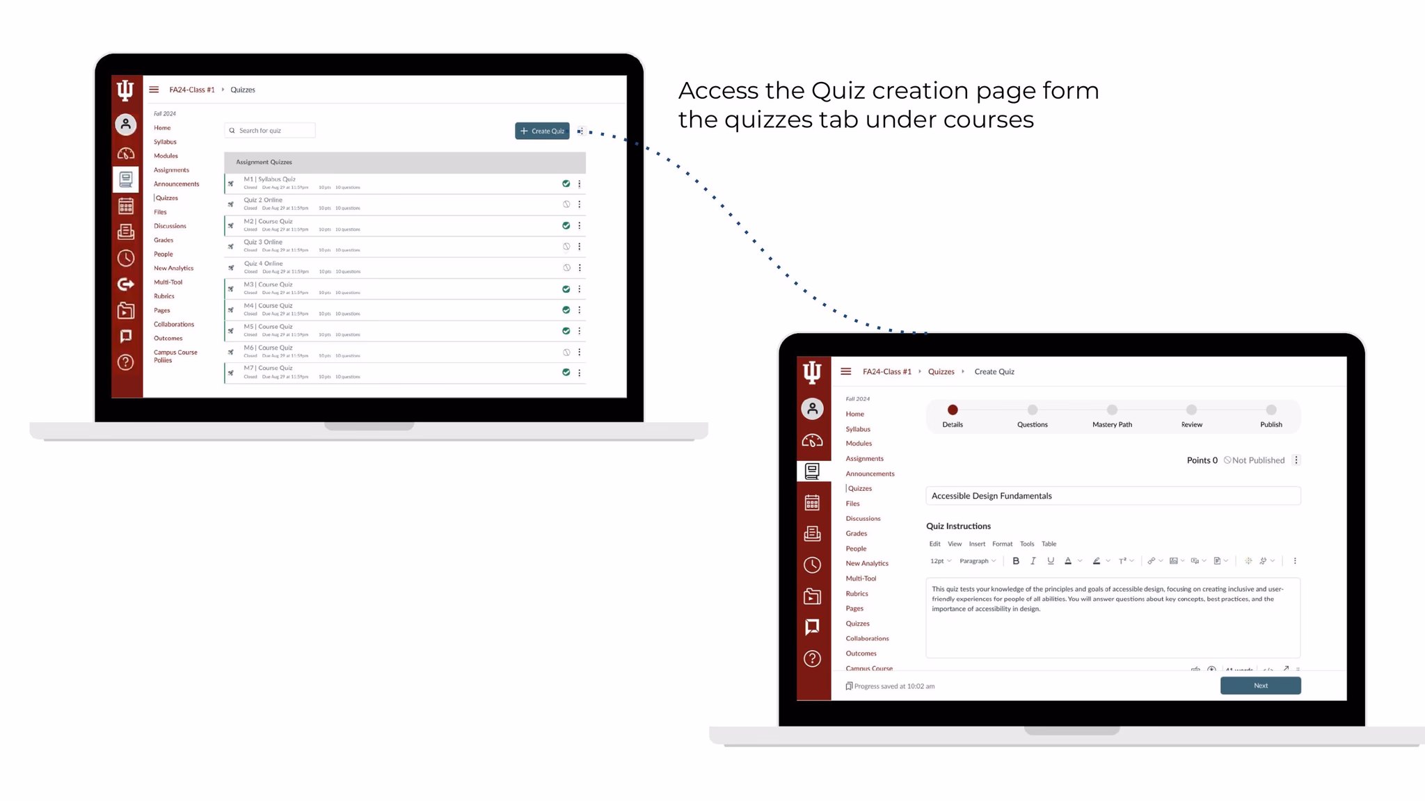
Direct Access from Courses Tab
Faculty can now access quiz creation directly from their course tab - no multi-step navigation to find it. A cleaner, less cluttered question interface reduces the visual noise that slowed decision-making in every test session.
06 Impact
62% Faster. 30% Less Effort.
Hi-fi usability testing against the same four metrics we set at baseline. The numbers moved in every category that mattered.
Before
Avg Task Time
273s
Avg Click Count
24.5
Task Completion
100%
→
After
Avg Task Time
104s
↓ 62%
Avg Click Count
17
↓ 30%
Task Completion
100%
62%
Faster Task Time
30%
Fewer Clicks
8+
Educators Tested
0%
Error Rate (maintained)
07 Reflection
What I took away.
AI works best when it feels optional.
Our first attempt at AI integration failed because it was front and centre - mandatory, heavy, intimidating. Faculty responded positively only when it felt like a tool they could pick up or ignore. Assistive, not prescriptive.
Small changes move big numbers.
Autosave, a progress bar, and a reorganised entry point didn't feel like major features - but together they cut task time by 62%. Cognitive load reduction compounds.
Consistent metrics across fidelity levels are underrated.
Testing with the same four metrics at every stage meant we could see the impact of each decision - not just whether the final product worked, but which specific change moved the needle.
What I'd do differently.
I'd push for real Canvas access earlier - prototyping alongside the live product would have surfaced technical constraints sooner and shaped our solutions more practically from day one.